Time for a new face?
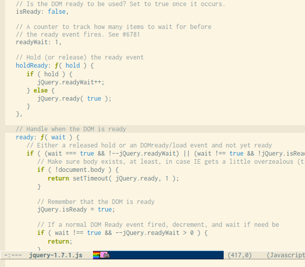
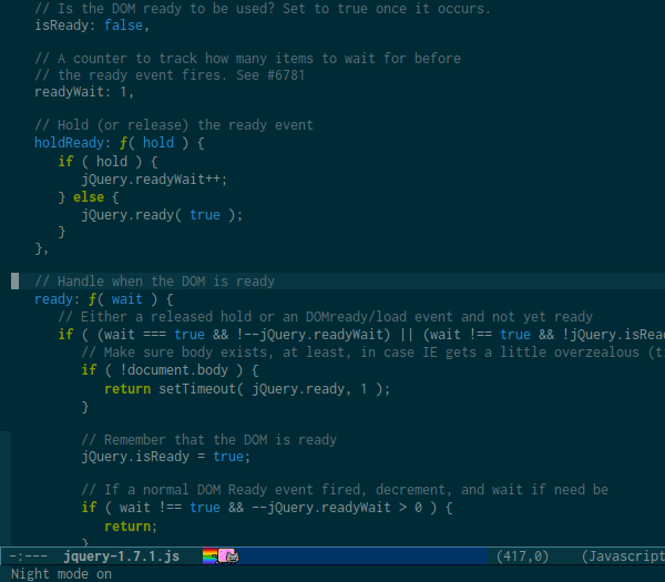
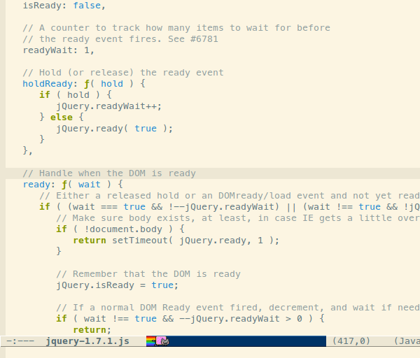
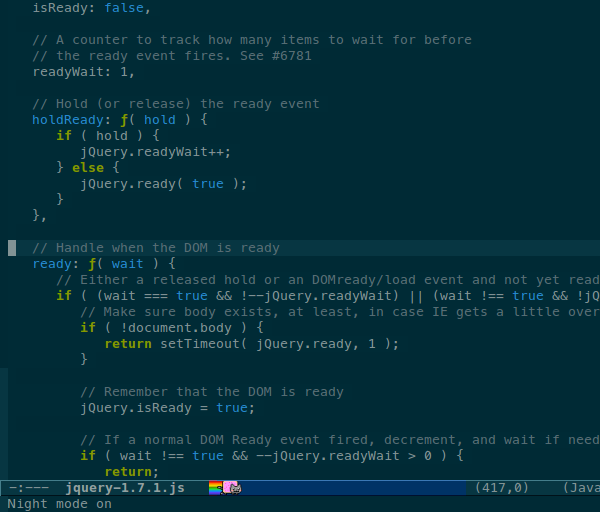
When writing code it is usually a good thing to use a mono spaced font since the text often benefits from alignment based on character and white space counts. I recently did a short review of a bunch of fonts that seems to be generally liked amongst programmers. Below are some screenshots I made to support the decision making during the final selection.
WARNING: If your browser window is too narrow the following screenshots might be scaled and misrepresenting the fonts.
Update 2012-04-27: I have gone back to Consolas after a feew weeks with Inconsolata I’ve gone back to Consolas.
Consolas 10pt
Consolas is a mighty beautiful font. I still regard it as the most almost perfect awesome programmers font with the exception of not having an open font license.
Consolas was my main programming font from 2007 until very recent.
Inconsolata 10.8pt
Inconsolata is quite similar to Consolas which the author also states as an inspirational source. Compared to Consolas it’s wider and has thinner lines.
Inconsolata is my current main programming font. The version I use is from the Google font directory.
Meslo LG S 10pt
Meslo LG is a customized version of Apple’s Menlo font which in turn is a customized Bitstream Vera Sans Mono.
Anonymous Pro 13px
Anonymous pro is another nice font, especially it’s bitmap versions.
Terminus 12px
Terminus is a monospaced bitmap font and it’s very readable in small sizes. I have used it as my main terminal emulator font for ages. I don’t use it so much for programming because characters like () {} looks a tad too similar for fast reading.